Progress bar:
Different styles of page progress bars are prepared by flutter code in admin panel, they can be animated and contain label:
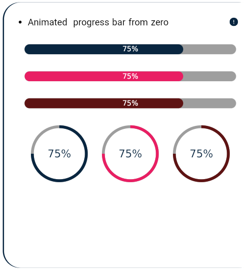
Animated progress bar from zero
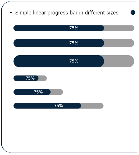
Simple linear progress bar in different sizes
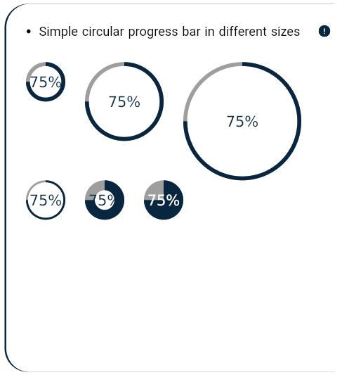
Simple circular progress bar in different sizes
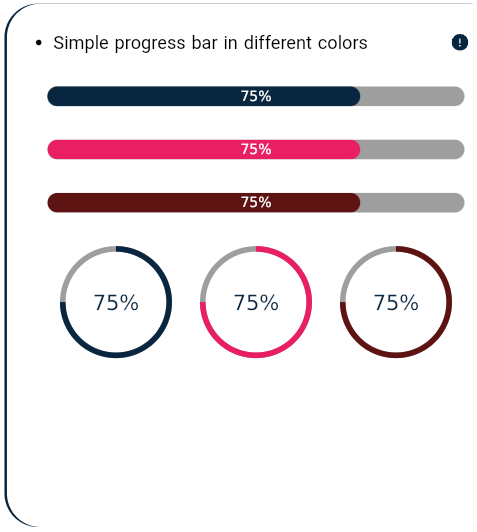
Simple progress bar in different colors
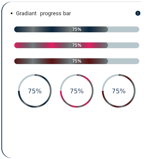
Gradient progress bar


Animated progress bar from zero:

It is a animated  progress bar from zero in different sizes that the percent_indicator package is added in pubspec.yaml 's dependencies
 and is used as:
 LinearPercentIndicator(
                    barRadius: Radius.circular(StructureBuilder.dims!.h3IconSize),
                    animation: true,
                    animationDuration: 1000,
                    lineHeight: StructureBuilder.dims!.h3IconSize*0.7,
                    percent:75/100,
                    center: EsLabelText("75%",color:StructureBuilder.styles!.primaryLightColor,),
                    progressColor: StructureBuilder.styles!.primaryColor,
                    backgroundColor: StructureBuilder.styles!.t2Color,
                  ),

Simple linear progress bar in different sizes:

It is a simple linear progress bar in different sizes that the percent_indicator package is added in pubspec.yaml 's dependencies
and is used as:
LinearPercentIndicator(
barRadius: Radius.circular(StructureBuilder.dims!.h3IconSize),
lineHeight: StructureBuilder.dims!.h3IconSize,
percent:75/100,
center: EsLabelText("75%",color:StructureBuilder.styles!.primaryLightColor,),
progressColor: StructureBuilder.styles!.primaryColor,
backgroundColor: StructureBuilder.styles!.t2Color,
),

Simple circular progress bar in different sizes:

It is a simple linear progress bar in different sizes that the percent_indicator package is added in pubspec.yaml 's dependencies
and is used as:
CircularPercentIndicator(
radius: StructureBuilder.dims!.h0Padding,
lineWidth: StructureBuilder.dims!.h3IconSize*0.2,
percent: 75/100,
center: EsHeader("75%",color:StructureBuilder.styles!.primaryColor,),
progressColor: StructureBuilder.styles!.primaryColor,
backgroundColor: StructureBuilder.styles!.t2Color,
),

 Simple progress bar in different colors:

It is a simple linear progress bar in different colors that the percent_indicator package is added in pubspec.yaml 's dependencies
and is used as:
LinearPercentIndicator(
barRadius: Radius.circular(StructureBuilder.dims!.h3IconSize),
lineHeight: StructureBuilder.dims!.h3IconSize,
percent:75/100,
center: EsLabelText("75%",color:StructureBuilder.styles!.primaryLightColor,),
progressColor: StructureBuilder.styles!.primaryColor,
backgroundColor: StructureBuilder.styles!.t2Color,
),

Gradient progress bar:

It is a gradiant progress bar that the percent_indicator package is added in pubspec.yaml 's dependencies
and is used as:
LinearPercentIndicator(
barRadius: Radius.circular(StructureBuilder.dims!.h3IconSize),
lineHeight: StructureBuilder.dims!.h3IconSize*0.7,
percent:75/100,
center: EsLabelText("75%",color:StructureBuilder.styles!.primaryLightColor,),

linearGradient: LinearGradient(
colors: [
StructureBuilder.styles!.primaryColor,
StructureBuilder.styles!.t2Color,
StructureBuilder.styles!.primaryColor,
StructureBuilder.styles!.t2Color,
StructureBuilder.styles!.primaryColor,
StructureBuilder.styles!.t2Color,
]),
),
