Tooltip
Tooltip
When the user presses on the widget or holds over the widget, it displays the text description of the widget in a floating label.
Different styles of tooltips are prepared by the flutter code in admin panel.
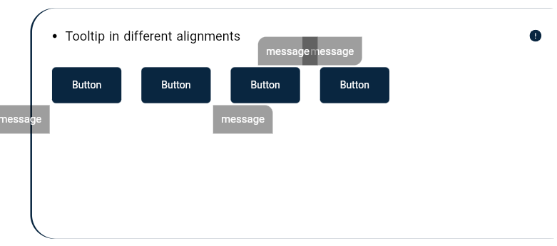
Tooltip in different alignments
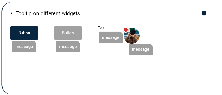
Tooltip on different widgets
Tooltip in different show duration

Tooltip in different alignments:

these are  tooltip in different alignments located in:
 es_flutter_component/lib/components/es_tooltip/es_tooltip.dart
 and is used as:
 EsTooltip(
                message: 'message',
                widget: EsButton(
                  text: AppLocalizations.of(context)!.button,
                  fillColor: StructureBuilder.styles!.buttonColor().primary,
                ),
                leftMargin: 150,),
Tooltip on different widgets:

these are tooltip on different widgets located in:
es_flutter_component/lib/components/es_tooltip/es_tooltip.dart
and is used as:
EsTooltip(
message: 'message',
widget: EsLabel(
isUnique: false,
widget: EsAvatarImage(
path: "assets/images/img4.jpg",
),
hasBorder: true,
widgetSize: StructureBuilder.dims!.h2IconSize * 0.1,
),
leftOffset: 50,

),
Tooltip in different show duration:

these are tooltip in different show duration located in:
es_flutter_component/lib/components/es_tooltip/es_tooltip.dart
and is used as:
EsTooltip(
message: 'message',
widget: EsButton(
text: AppLocalizations.of(context)!.button,
fillColor: StructureBuilder.styles!.buttonColor().primary,
),
showDuration: Duration(milliseconds: 500),
preferBelow: false,
),


